How to Start a Small‑Town Publication
There are people in your community whose stories aren’t being told. Here’s how to build a platform that does something about it — without losing your mind or your savings.
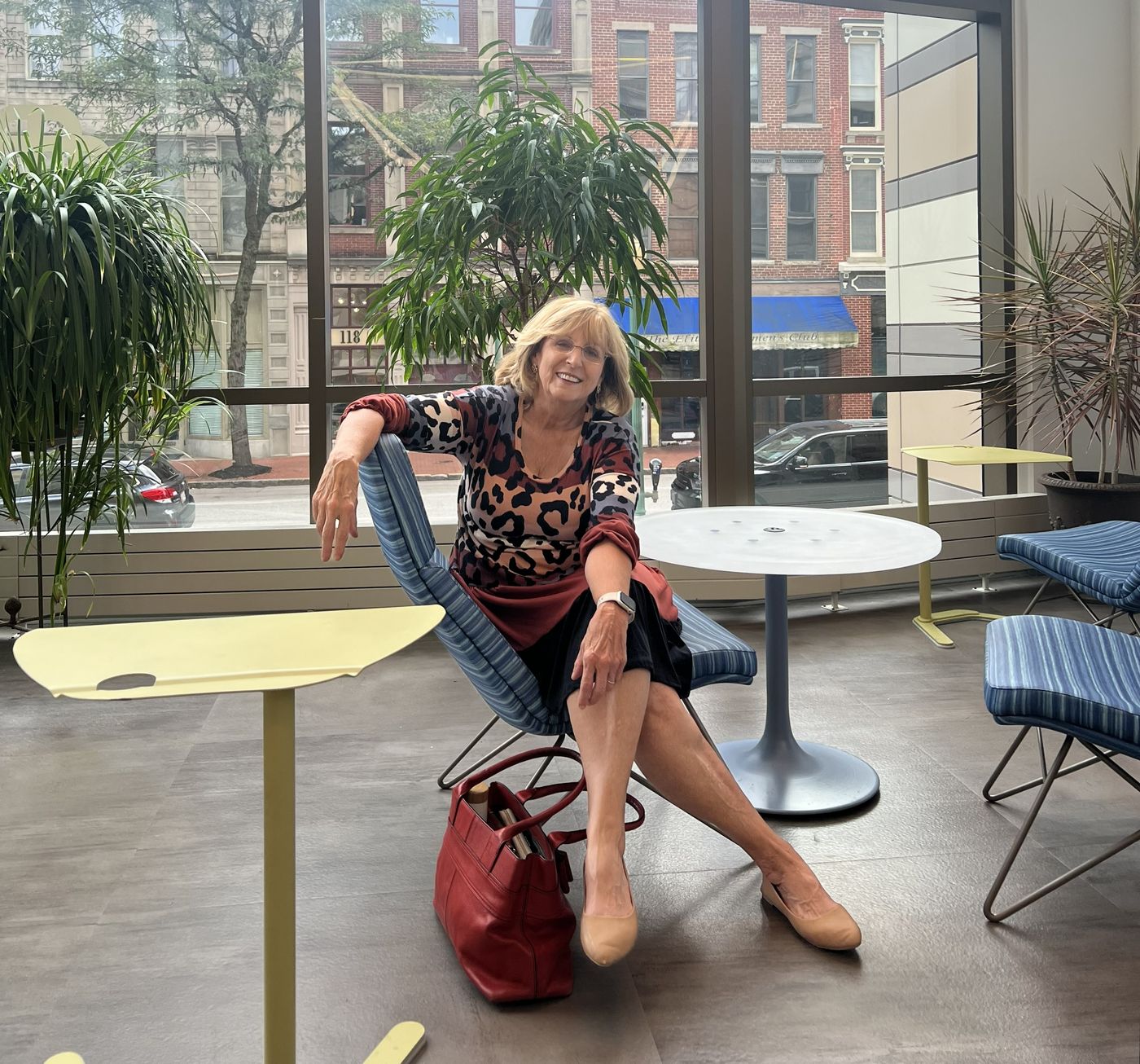
The origin. Cyndi Tawney, Editor-in-Chief — Charleston, WV public library. The rolling stone of this idea was gathering no moss, so she acted.
This guide is for every small town. Not just West Virginia, not just river towns, not just magazine-style publications. Whether you’re building a newsletter in rural Montana, a quarterly broadsheet in a small Midwest county, or a digital digest for a mountain community in Vermont — the principles here apply. Elk River Living is the case study. Your town is the subject.
One fact for the record before anything else: ERL exists because of my mother. In 2016 the water took her hometown, and after two years of rebuilding she stopped thinking of the magazine as something she might do one day. In 2018 I had just come off a deep dive in brand strategy with Prophet in Manhattan and was regrouping at my parents’ place in Elkview, not at my best, when she came to me with the thing she’d carried since her journalism degree at WVU — she had always wanted to start a magazine. I asked if she understood everything that entails. Typical of my mother: “Let’s do it.” We did. Everything in this guide is what we learned by doing it.
Local publications are one of the most direct and durable expressions of civic identity a community can produce. Not a Facebook group, not a podcast, not a news aggregator — but a physical or digital object that says: we made this, about us, for us.
The barriers aren’t technical. They never were. The barriers are conceptual: people don’t know where to start, they underestimate what it costs in time, and they over-engineer the design before they’ve written a single sentence of copy.
This guide is built around a simple argument: the best local publication is the one that actually gets made. Everything in here is oriented toward getting you to a first issue — modest, honest, and worth reading. Scale comes later.
The best local publication is the one that actually gets made.
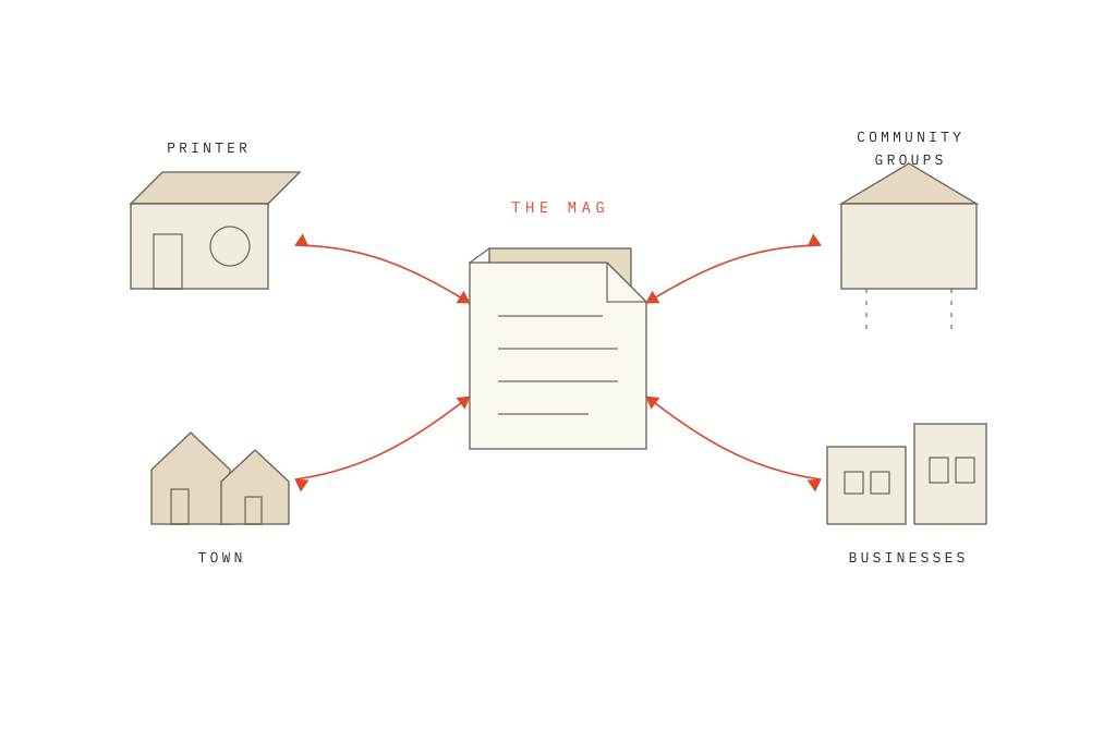
A publication is not an object. It is a system.
]By the end of this guide you will have named the purpose, cadence, reader, identity, mission, people, recurring segments, relationships and operating conditions of a publication rooted in one place.
Start with place.
You are not inventing an identity — you are recognizing one. The touchstones are already there: the river, the recipes, the team, the trail. Your first editorial act is simply to notice what the place already knows about itself.
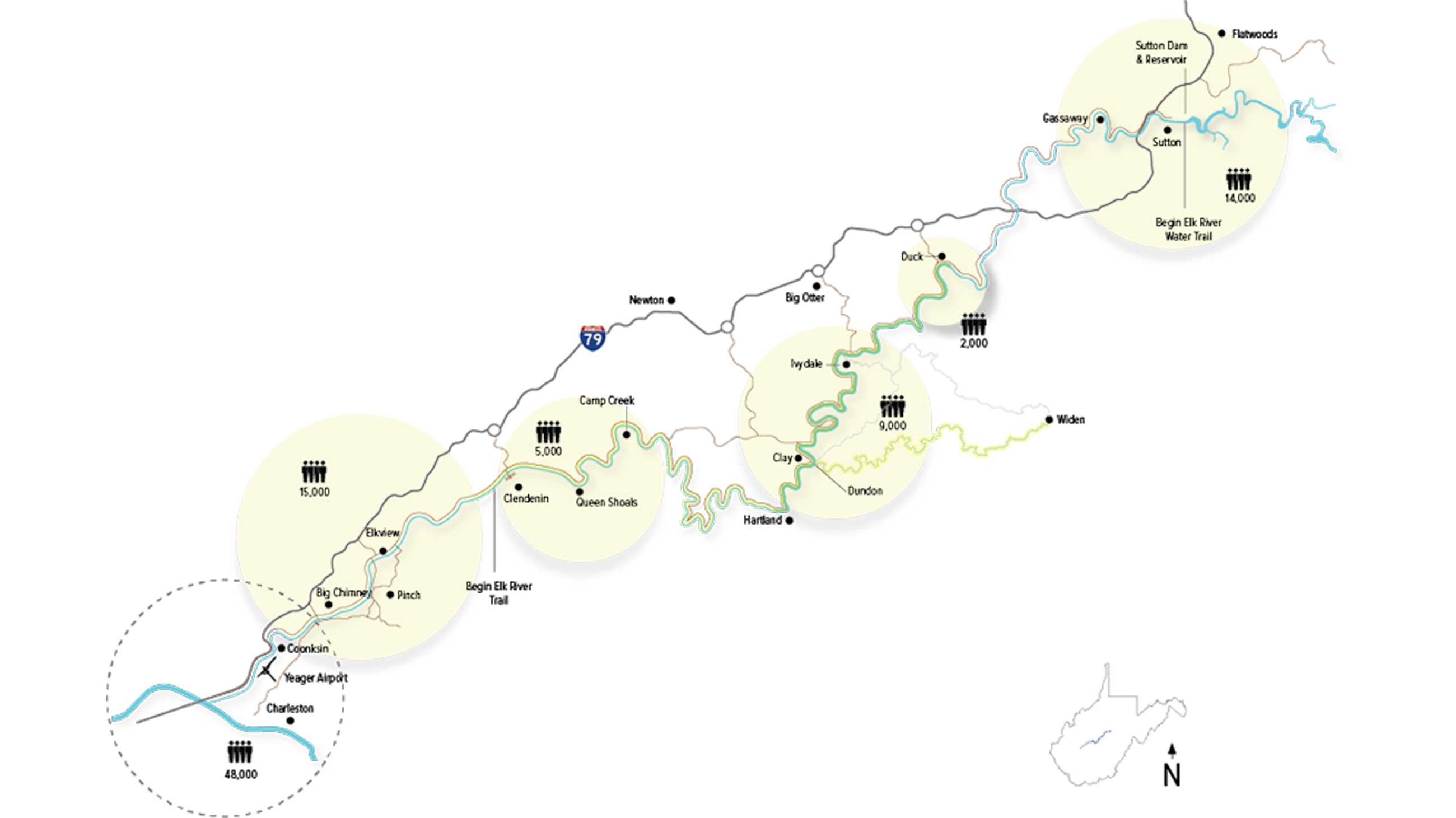
Touchstones become segments.
A touchstone is a fact about the place; a segment is that fact given a masthead and a deadline. The segment format is what readers come to expect issue to issue — consistent, and ever-changing. It is the difference between having ideas and having an engine.
Partners, not advertisers.
The businesses in your pages are not revenue with a logo. They are co-authors of the same project — a town worth reading about. Celebrate them, show up to their ribbon cuttings, and mean it. The economics follow the sincerity, not the reverse.

The route.
Eight parts and a coda — each one links, jump anywhereStart honest.
Before you open a design application, before you register a domain, before you ask anyone to write something, answer three questions honestly. They don’t need fancy answers. They need true ones.
What is this actually for?
Not what you’ll tell people — what you actually believe. Is it to document a place you love? To build community connection? To support local businesses? To give a platform to voices that aren’t being heard? The answer doesn’t need to be noble; it needs to be honest. Publications that don’t know why they exist tend to fail quietly after two issues.
What can you sustain?
Monthly is ambitious. Quarterly is sustainable. Annual is a book. Think carefully about which format matches your actual available time — not your best-case scenario time. A publication that ships consistently on a modest schedule earns far more trust than one that burns bright and disappears. Consistency is the editorial virtue that matters most.
Who is your reader?
Specificity is a gift, not a limitation. A publication for everyone is a publication for no one. “People who live along the Elk River” is a more useful answer than “people in central West Virginia.” The tighter your reader definition, the more precisely you can choose stories, tone, and format.
With those three questions answered, you have the foundation for every editorial and design decision that follows.
The identity package.
Local publications are often tempted to solve identity with complexity — a dozen fonts, an elaborate logo system, elaborate templates. Resist this. The most important visual characteristic your publication can have is consistency, and consistency is easiest to maintain when there’s less to keep track of.
The bare-bones package is: a name, two colors, and two fonts. Everything you need is in those five decisions — and you’ll watch every one of them land on your cover as you make it.
Two colors · pick, and name them after your place
A primary color.
This is your publication’s personality, visible at a distance. It should be distinctive — not generic navy or stock red — but grounded in your community’s character: the landscape, the local architecture, the seasonal traditions. It will headline your logo and anchor your design system.
An accent color.
The pointing color: pull quotes, segment bars, link states, the call to act. It should contrast with your primary and work at small sizes. You do not need a third color in year one — add depth only after the two-color discipline has proven it can hold an issue together.
Two typefaces · one to be read, one to be seen
A text font.
Readable at small sizes, comfortable in long passages — this is where your words actually live, the other 95% of every page. A well-drawn serif with a complete family carries body copy and captions without once calling attention to itself. Choose reliable over trendy: the face you can still stand to read by issue nine is the right one.
A display font — your masthead’s voice.
For being seen: the masthead, headlines, the cover. It should harmonize with your text font, not compete with it — legible large, clean small, distinctive enough to be yours. Pick one and your masthead resets in it, instantly.
And a logo you don’t overthink
The wordmark — and the low-hanging fruit.
Your publication’s name, set with care in your display font, is your logo. For a local publication the name itself — well-spaced, properly weighted, reproduced consistently — is the identity. Don’t spend six weeks on a logo before you have a single piece of content.
The actual low-hanging fruit: your community has visual symbols that already carry meaning — a river, a landmark, a local animal, a plant. These are earned marks. Use them only if you can render them cleanly and they connect genuinely to your content.
Name it on the masthead — right there, on your cover. →
Document it. Even briefly.
A one-page style reference — hex codes for your colors, font names and sizes, a sample header and body paragraph — is worth making before your first issue. You’ll reference it when you’re tired, when someone else is helping, and when you’re building issue seven and can’t remember which green you chose.
And the cover photograph · your town, at a distance
Put your place on the cover.
Optional. Give a location — town, state, or ZIP — and the cover photograph at right becomes your town itself: public satellite imagery, printed in your primary color.
Five colors, two typefaces, built on community character.
Elk River Living developed its visual identity around the landscape and culture of the Elk River corridor in West Virginia — five colors that reference the river itself, the region’s forests, and the warmth of the communities that line its banks, and two typefaces to carry every word of it.
The system anchors on a deep Bridgewater green as primary, with a brick red as the accent that runs through every segment header bar. The supporting neutrals — a warm tan, an ivory, a pale blue — keep the pages open and inviting without requiring elaborate layout decisions.
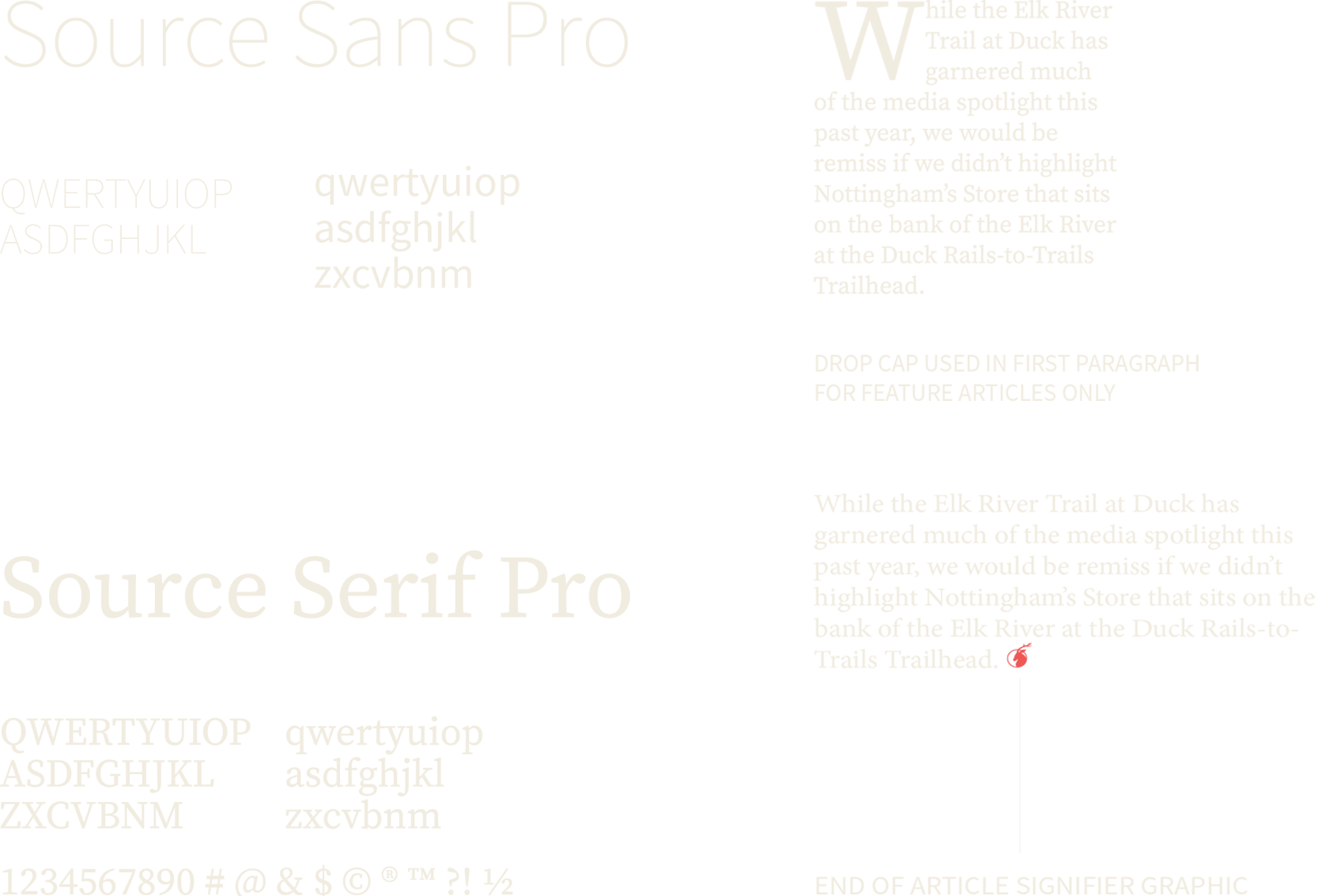
Source Serif Pro carries the editorial copy and main headlines; Source Sans Pro handles secondary and supplemental text. The consistency of these choices across every issue, every year, is what makes the publication immediately recognizable.
The mission statement.
Write your mission statement before you design anything. Before the logo. Before staring at the color palette. Before a deeper font rabbit hole.
A mission statement does three things: it tells contributors what you’re making, it tells readers what to expect, and it tells you — six months from now, when you’re tired — whether a potential story belongs in the publication.
The requirement: it must be one or two sentences. It must be specific enough that someone could read it and know what kind of story does not belong in your publication. If you can’t say no to anything, you haven’t written a mission statement — you’ve written a press release.
The team.
A local publication can be made by one person. It can also be made by a tight team of three or four. What it cannot survive is a committee.
Who you actually need
An editor-in-chief — or equivalent.
Someone has to make final decisions about what goes in and what gets cut. This is not a democratic process. The editor’s taste and judgment is what gives the publication a voice. Without a single decider, you get committee writing — pleasant to everyone, interesting to no one. This person should also be the one who knows the community deeply. Outsiders can contribute; they rarely make good editors for local publications.
One designer, however modest.
You don’t need a professional. You need someone who has set up your template correctly, understands the style guide, and can execute it consistently under deadline. If you can do both jobs yourself, do them. Splitting them between two people who communicate well is also fine. Having four opinions on every layout decision is not.
Contributors — not staff.
Build a network of community contributors who submit content to recurring segments. A local gardener for the garden segment. A physical therapist for the health column. A local history enthusiast for the historical retrospective. These contributors don’t need to be writers — they need to be engaged community members who have something worth saying. Your editor’s job is to help their voice come through on the page.
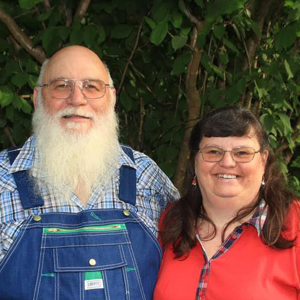
At ERL that local gardener is Laura Boggess Shafer, who farms with her family near Clendenin. She writes The Elk’s Garden every month — gardening, canning, preserving — and every month her boys compete to see who made it into the print or web version of ERL. With Laura they have become unofficial “mascots” of The Elk’s Garden. That is the whole argument for contributors, in one family.
Too many cooks.
The most common failure mode for community publications isn’t lack of interest — it’s governance collapse. When everyone is an equal stakeholder in every decision, nothing ships. Be honest early about who holds decision-making authority. This can be communicated warmly: “I make the final call, and I will always listen” is a perfectly acceptable editorial structure. Enshrine it before the first conflict, not during.










Recurring segments.
This is the step the whole system stands on.
]Find the two or three things your community already knows itself by — the recipes, the river, the school, the trail — and give each one a masthead and a deadline. That is a segment, and the segments are what make issue nine as achievable as issue one. Everything before this page was preparation; everything after it is maintenance.
A note on scope
The segment examples in this section draw from Elk River Living as a case study — but the principle applies everywhere. A coastal fishing community, a plains agricultural town, a mountain trail corridor — each has its own version of a cookbook, a history column, a youth beat. The segment names change. The structure doesn’t.
The hardest part of publishing consistently isn’t the big feature story. It’s filling the rest of the pages, issue after issue, without burning out your core team or recycling the same material.
Recurring segments solve this. They are the structural backbone of a sustainable local publication — a predictable architecture that tells readers what to expect, tells contributors exactly what they’re being asked for, and gives editors a reliable template to fill each cycle.
Each segment should have a name, a consistent place in the layout, a defined scope, and a reliable contributor pool. Once established, segments essentially produce themselves — you’re curating and editing, not originating from scratch each time.
Building your segment list
Start with fewer segments than you think you need. Three to five is a reasonable first-issue target. Each should meet two criteria: you know who will contribute to it, and you can imagine it running for ten issues without exhausting the subject.
The Community Chronicle
Events, milestones, local news briefs. Births, openings, achievements, closings. This segment writes itself if you have a few community correspondents who know what’s happening. Its value is as a reference — people save issues specifically to look up what happened when.
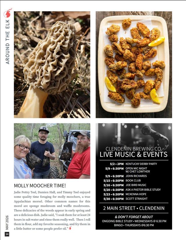
ERL · Around the Elk and the Events listings serve this function — a consistent local beat that gives every issue an immediate time-stamp.
The Historical Retrospective
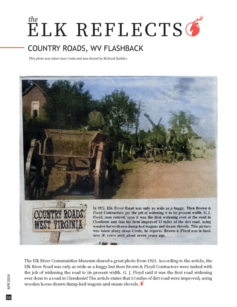
Every community has more history than it remembers. This segment requires a contributor who loves research and has access to archives, photographs, or oral tradition. Even a single well-researched piece about a local building, a family, or an event creates a reason for long-time residents to subscribe and new residents to understand where they’ve moved.
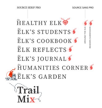
ERL · The Elk Reflects picks a moment in history and revisits it — the region’s deep Appalachian roots keep it fed issue after issue.
The Practical Segment
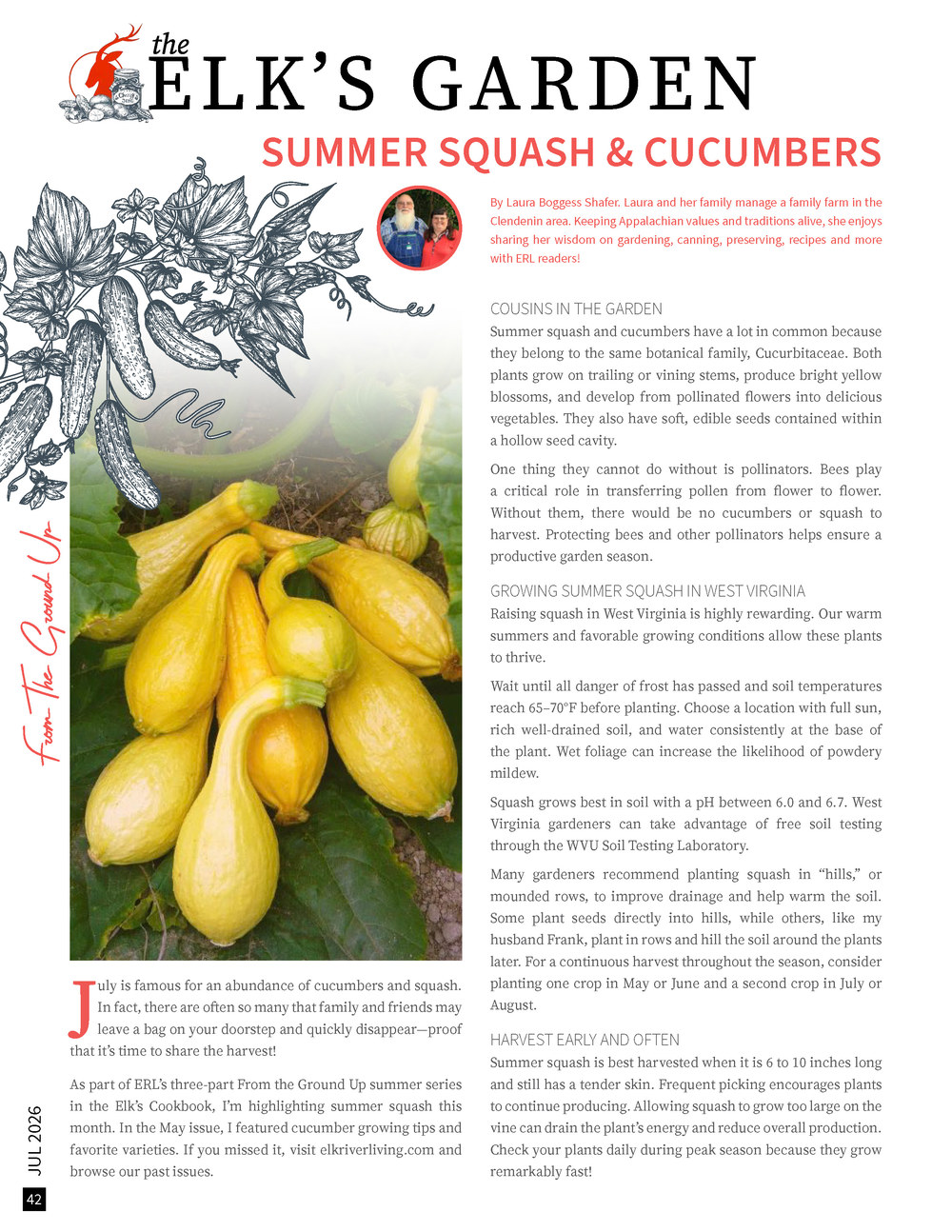
Gardening, cooking, health, outdoor recreation — content that people read because it is useful to them today. These segments draw in contributors who have specific expertise and readers who might not otherwise pick up a community magazine. They are the pragmatic foundation of a mixed-content publication.
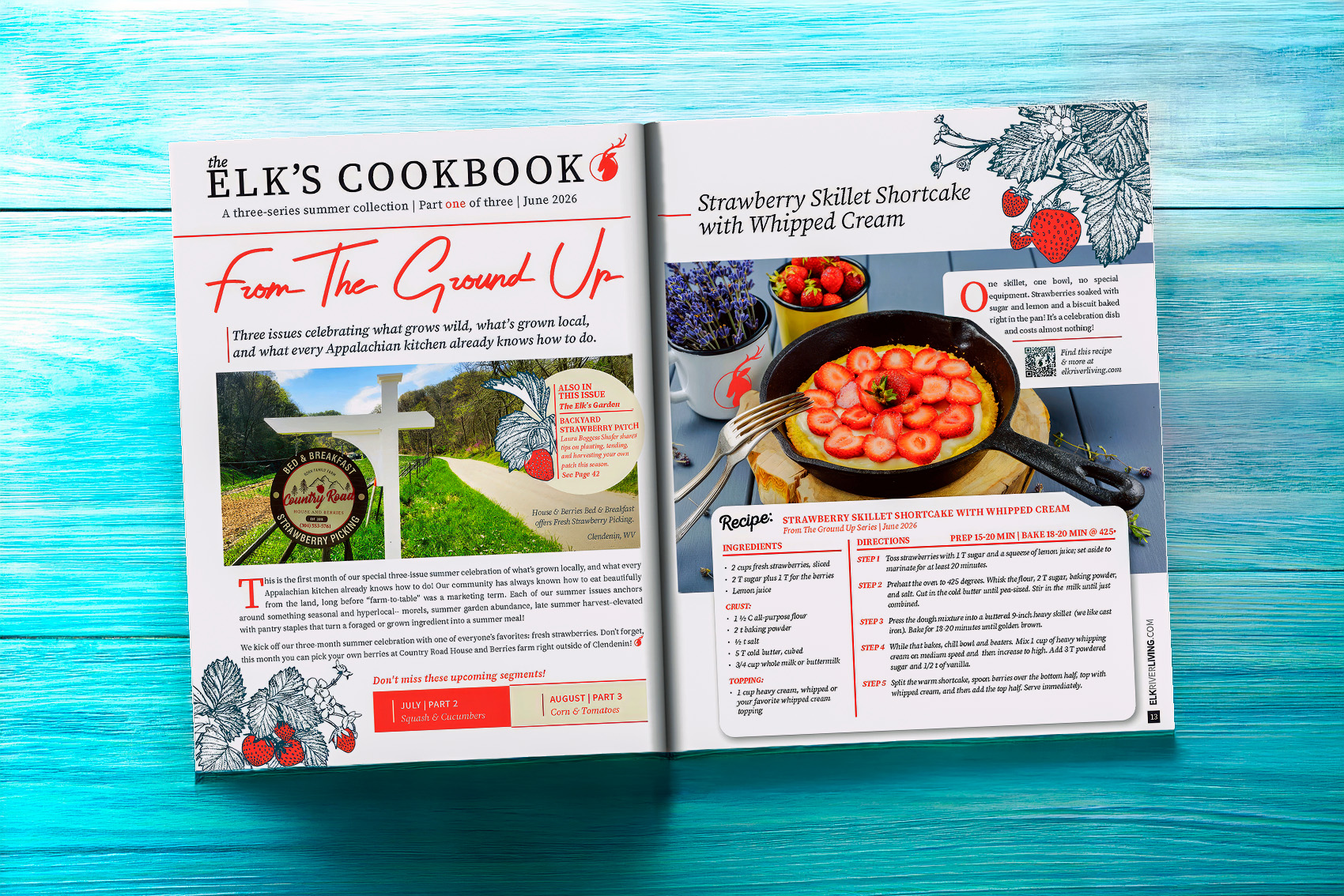
ERL · The Elk’s Cookbook, The Elk’s Garden, and The Healthy Elk — three practical segments, each with its own contributor network and loyal readership. The Garden is written every month by Laura Boggess Shafer, who farms with her family near Clendenin — gardening, canning, preserving, and the recipes that come out of both.
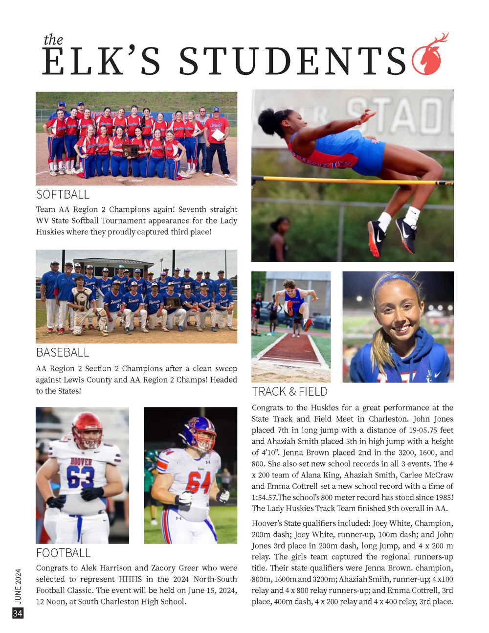
The Youth & Education Beat
Acknowledging students — academic awards, athletic achievements, creative work — guarantees that parents and teachers pay attention. This segment also positions the publication as an institutional asset to local schools, opening doors for in-school distribution and educational partnerships.
ERL · The Elk’s Students acknowledges young people — and ERL’s editor-in-chief works directly with students on writing and journalism.
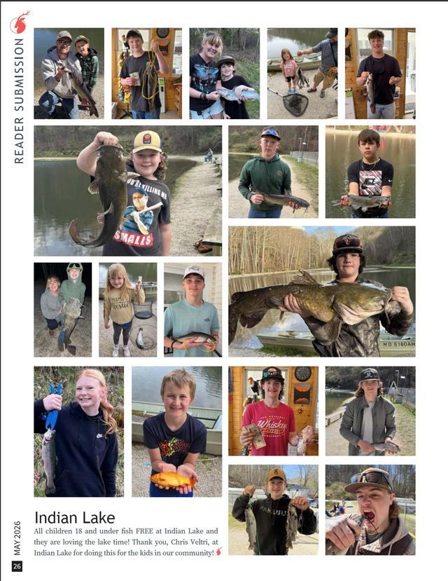
The Community Submission
A standing invitation for readers to appear in their own magazine — photographs, letters, recollections, any format the town produces. This is crucial for reasons that compound: it puts a town member’s name and personality into print, they tell their friends, family, and co-workers, and those people go to the site — or subscribe. The submission segment is how readership becomes membership.
ERL · Reader Submission — and readers love submitting photographs they’ve taken of the area most of all.
The Institutional Partnership
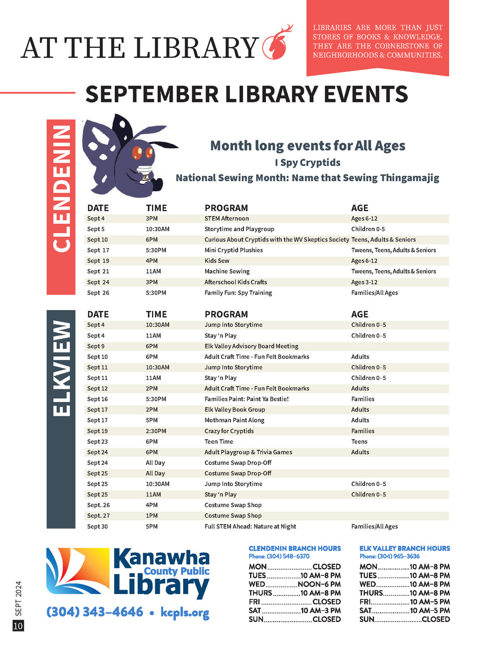
Every town has organizations that already produce information on a schedule — a library’s calendar, a trail foundation’s updates, a historical society’s programs. They have something worth publishing and no reliable way to reach the people who would act on it. A standing page trades your audience for their content, and because it runs on their operating rhythm rather than anyone’s goodwill in a given month, it is the segment least likely to run dry.
These pages are structured data, not prose — dates, times, ages, hours. Design the template once and the recurring work becomes placement instead of writing. Be honest about how they start, too: someone at your table probably already sits on that board. Small publications are made by people who are at every meeting anyway.
ERL · At the Library carries the Kanawha County Public Library’s Clendenin and Elkview calendars every month, and Trail Mix runs the same way alongside the Elk River Trail Foundation.
Expect the segments to evolve in both design and content. We didn’t expect The Elk’s Journal to become a popular place for local authors to submit excerpts of their most recent work — it earned that role, and we let it keep it.
And expect readers to adopt favorites. People began writing to ask for the recipe page as a PDF so they could save them — so we added a download link to the site. The month’s recipe eventually got its own cost estimator, a little widget that totals what the dish costs to make. None of that was in the plan. All of it came from readers loving a segment enough to ask it for more.
The real cost.
Most guides to starting a publication give you a budget line for printing and a budget line for web hosting and call it done. That accounting is honest as far as it goes — but it misses the line item that actually determines whether a publication survives: your time.
Before the first issue ships, walk through the following ledger. Not as a deterrent, but as a calibration. Every item is solvable — but each one needs a plan before you start, not after you’re three issues in and already exhausted.
How many pages per issue? More pages means more content to source, more design time, and more printing cost. Start with fewer pages than you think you need. You can always add.
Stock weight and finish affect both cost and feel. Newsprint is affordable and nostalgic. Matte coated reads as intentional. Gloss can cheapen photography. Ask your printer for samples before you commit.
Local offset printing builds community relationships and supports the local economy, but requires larger print runs. Print-on-demand offers flexibility at a higher per-unit cost. Digital printing scales down well for test runs. Know your minimum viable quantity before you choose.
How does the publication get to readers? Drop locations, subscriptions, mail, digital — each has a different cost and labor profile. Build the distribution network before issue one. At ERL, Ken and Cyndi deliver much of the run themselves — the magazine is free, and hand delivery keeps it that way. Do what makes sense for you.
Do you need one? Probably yes, eventually. But a publication does not need a full editorial website to exist. A simple page with subscription information, back issues, and contact details is enough to start. Don’t build the website instead of the magazine.
If you’re not the designer, factor in design costs per issue. If you are, factor the time as an honest opportunity cost. Building a clean template once reduces this dramatically — the first issue is the design investment; subsequent issues are execution.
The most underestimated line item. Editing, coordinating contributors, managing printing, handling subscriptions, social media, email — this is where publications fail. Map the hours honestly. Then add 40%. If the number still works, proceed.
Community & commerce.
A local publication is a microeconomic asset. This is not incidental — it is structural. The editorial relationship between a publication and its local business community is one of the most durable models for small-press sustainability.
Local businesses advertise in local publications because the readers are their customers. Unlike digital advertising, a physical local publication has a captive, targeted, trusted audience by definition. The subscriber lives in the same place as the business. The trust a well-made local publication earns with its readers extends, partially, to the advertisers who appear in it.
Do not expect them to arrive knowing how to be advertisers, either. If you had asked most of the businesses along the Elk River what their advertising budget was, they would have laughed — they had never needed one, because the community had always carried their word for them. So ERL met them halfway: any business that agreed to advertise got its ad designed for free, revisions and all, and kept the finished files for anything else they wanted. The rates, too, were set to what the valley could actually carry. More than one owner laughed at the first proof — they had never expected to see their business represented that way. In a town without ad budgets, the design is your half of the exchange.
This means your editorial integrity directly affects your advertising value. If you take bad ads, write puff pieces, or compromise stories to protect sponsors, you erode the trust that makes your platform worth advertising in. The line between celebrating local businesses and being in their pocket must be drawn clearly and held consistently.
The healthiest relationship is one where the publication actively covers local business as a beat — not just in advertising pages, but in editorial. A story about a new bakery opening, a profile of a long-running hardware store, coverage of an economic development project — these serve readers as news and businesses as visibility simultaneously. That overlap is the microeconomy loop.
 Case Study · Elk River Living
Business as editorial subject, not just advertiser.
Elk River Living treats local businesses as an integral part of the fabric of the places it covers — not as a revenue stream to be managed separately from editorial content. Business features run alongside community stories, with the same care and the same voice.
“These businesses care a great deal about the community.” That orientation — seeing businesses as community actors, not just commercial entities — keeps the editorial relationship clean and honest.

ERL runs no politics and no religion. Your town may need a different line — but it needs a line.
]Ours is a choice about inclusion, not avoidance — the magazine should be the one place in town where everyone is simply a neighbor. What it holds up to the valley is the good already happening in it, reflected back month after month until people can’t help but see it. If your publication is a church newsletter, write the opposite rule. Know your audience; draw the line early; enforce it warmly.
What sustainability looks like.
A publication is sustainable when it can produce the next issue without a crisis. That’s the whole bar. Not profitable. Not growing. Not award-winning. Just: the next issue happens, more or less on schedule, without someone having a breakdown to make it happen.
The systems that produce sustainability are boring to describe but decisive in practice: contributor agreements, editorial calendars, template files, a submission inbox, a clear ad booking process. Each of these, built once and maintained, saves hours per issue indefinitely.
The editorial calendar.
A simple document listing your upcoming issues, their themes, and their deadlines. Share it with contributors six weeks ahead. Follow it imperfectly. Revise it quarterly. Having a calendar — even an imperfect one — converts the publication from a series of crises into a series of manageable sprints.
Seasonal themes generate structure naturally: a spring gardening focus, a back-to-school issue, a holiday community feature.
The template, maintained.
Your design template is a piece of infrastructure. Treat it like one. Update it when needed, don’t improvise around it when under deadline, and make sure anyone who touches it understands what is fixed and what is flexible. A broken template is the most efficient way to turn a manageable deadline into an emergency.
Master page files with locked elements and unlocked content areas prevent the drift that accumulates over years. Version them.
The contributor relationship.
Treat contributors as collaborators, not vendors. Send a thank-you note when something runs. Acknowledge their work in the issue. Give them lead time. Ask for feedback. The difference between a contributor who submits once and one who has been with you for five years is almost entirely a function of how they were treated after the first piece ran.
A publication that has been running for eight years has usually solved the contributor problem. The segments become institutions; the contributors become part of the identity.
Coda — begin before you’re ready.
The most common failure mode for aspiring local publishers isn’t lack of resources or talent. It’s waiting for the conditions to be exactly right before starting. The logo isn’t good enough yet. There aren’t enough contributors yet. The template needs one more round of refinement.
There is a publication in your community that doesn’t exist yet, about people and places and businesses that aren’t being written about, read by neighbors who would subscribe immediately if someone simply made the thing. You have, in all likelihood, everything you need to begin a first draft of it right now.
The bar for a local publication is not The New Yorker. The bar is: did someone who lives here make something worth reading about where we live? That is achievable. That is worth doing. That is, over time, how a place comes to know and value itself.
Start simple. Start honest. Start now.
A field guide, not a lecture. The system behind eight years of Elk River Living, written down for the next town over — and for anyone who suspects their town deserves a magazine.
Genuinely stuck between parts? JOSH@ELKRIVERLIVING.COM — I answer.
You’ve read the whole thing, and answered as you went. There is nothing left to fill in — the name, the colors, the type, the reason are already yours. The ball is in your hands.

