Signage and guidelines for the Encompass Health merger — a cohesive, professional identity for the newly formed company, from exterior monument to meeting room.
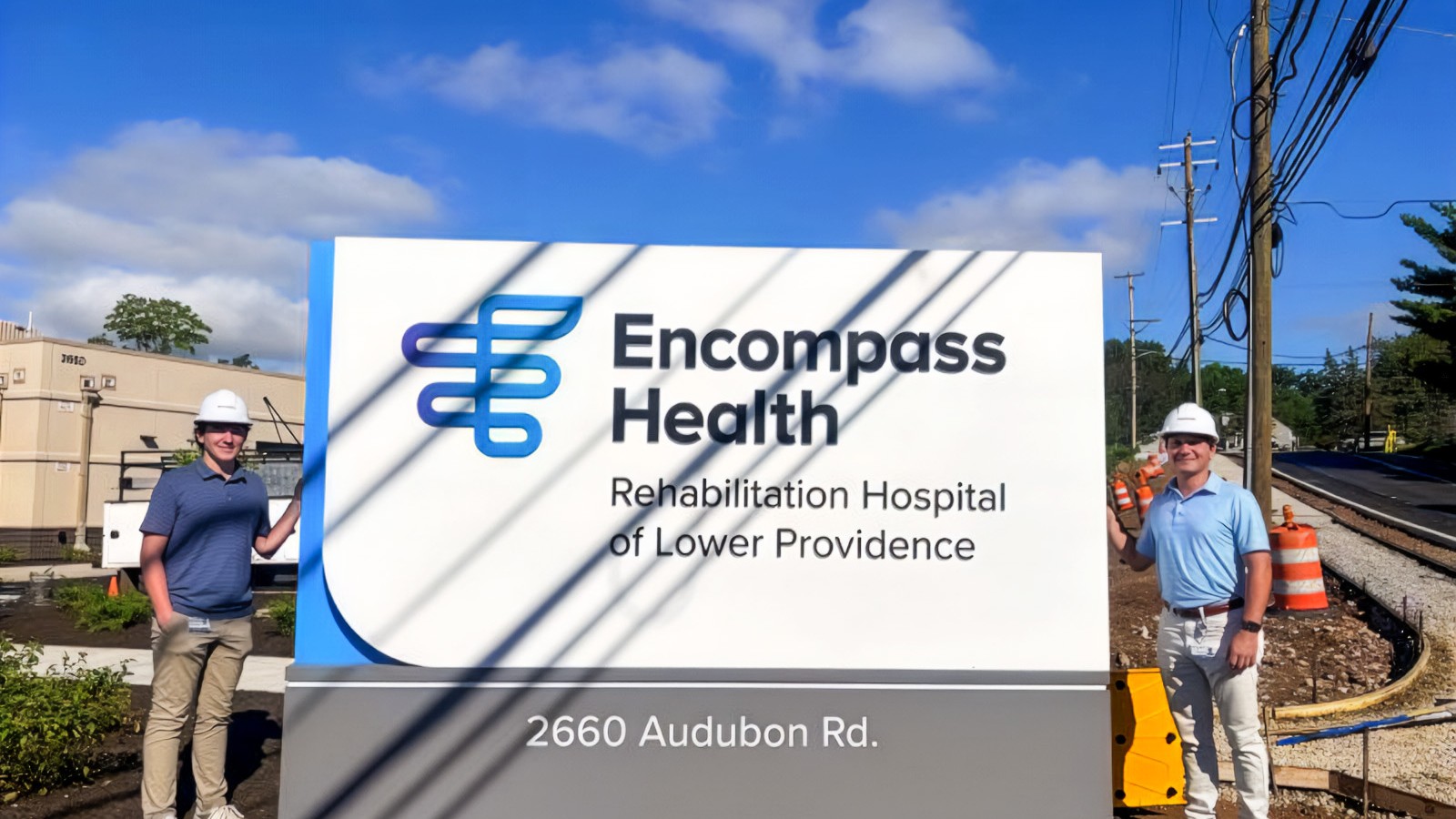
HealthSouth was one of the largest post-acute healthcare providers in the country when it merged, changed its name to Encompass Health, and came to Prophet for the new identity. I was design lead on signage and the parts of the guidelines package that touch a building. A rename at that scale is not a graphics exercise: a national footprint of hospitals, rehabilitation facilities and offices — almost none of them purpose-built, no two facades alike — all had to start saying the new name, correctly, at once.
One of four accounts I worked at Prophet between 2017 and 2018; the others were Chopt, Arby's, and Mitchell Grocery.
I drew the signage family: fourteen types keyed A through N, covering mid-rise and low-rise building-mounted signs, mounted panel, window, post, tall and short pylon, tenant, monument, horizontal and vertical banner, reception, multi-story lobby, and window and door decals. With them came the clear-space diagrams and application standards that decide what happens when a sign meets a facade nobody drew it for. Pylon proportions were tested against the mark rather than against the building; monument and facade applications were modeled and rendered, including the freestanding flagstone plinth and the illuminated night condition, and the rollout was sequenced against the merger's own timeline so the sign types arrived in the order the company needed them. Peter Dixon flew me to Birmingham to co-present it at their headquarters.
A rename is a construction project.
Two companies became one and the name changed; nothing about the buildings did. Hundreds of existing facades, mountings and sight conditions had to carry the new mark without anyone rebuilding anything. The identity is the easy half; what takes the time is making it survive the building stock it inherited.
A signage family is a rule, not a set of drawings.
Fourteen types is a catalog, and a catalog is only useful until someone hits the condition it does not cover — which happens immediately. What actually travels is clear space: the one standard that still applies on a facade you have never seen, in a town you will never visit, being installed by a fabricator you will never speak to.
Proportion is set against the mark, not against the building.
A pylon that looks right next to its own building will look like a different company parked next to the last one. The studies test the sign against the mark at every distance, so the family reads as one system across sites that have nothing else in common.
The night condition is the drawing that matters.
Post-acute care is not a nine-to-five building. Somebody is finding it at two in the morning, from a car, on the worst day of their year. That is when the facade sign does its actual work, and it is why the illuminated condition was drawn as a design case rather than an electrical note.
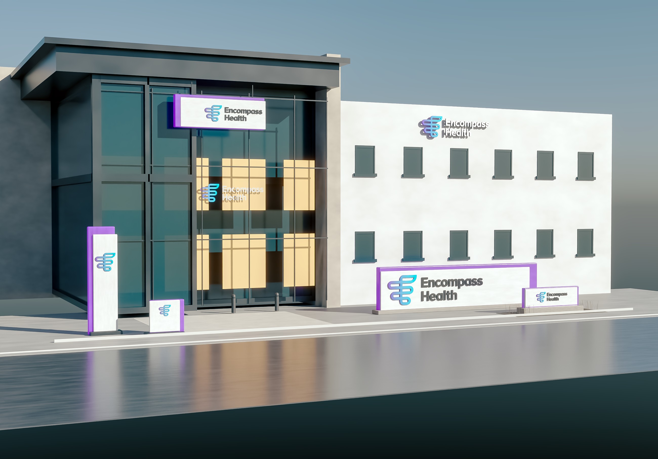
Monument and facade signage — the concept modeled and rendered before the next move.
Monument and facade signage — the concept modeled and rendered before the next move.
Monument and facade signage — the concept modeled and rendered before the next move.

A rename is a construction project. Two companies became one and the name changed; nothing about the buildings did.
A rename is a construction project. Two companies became one and the name changed; nothing about the buildings did.
A rename is a construction project. Two companies became one and the name changed; nothing about the buildings did.
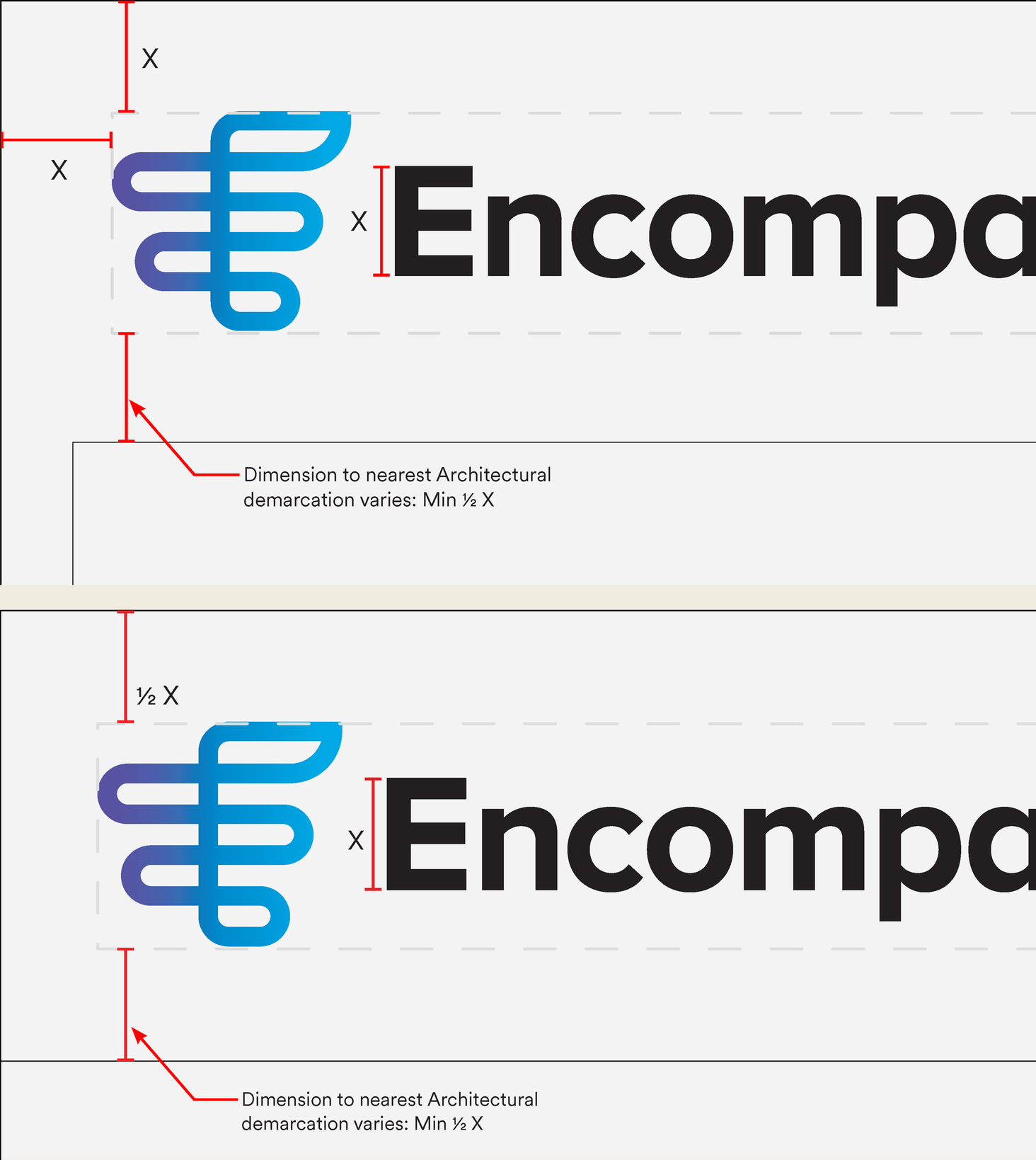
Building signage guidelines — clear space, lockups, and application standards.
Building signage guidelines — clear space, lockups, and application standards.
Building signage guidelines — clear space, lockups, and application standards.
What actually travels is clear space: the one standard that still applies on a facade you have never seen, in a town you will never visit, being installed by a fabricator you will never speak to.
What actually travels is clear space: the one standard that still applies on a facade you have never seen, in a town you will never visit, being installed by a fabricator you will never speak to.
What actually travels is clear space: the one standard that still applies on a facade you have never seen, in a town you will never visit, being installed by a fabricator you will never speak to.
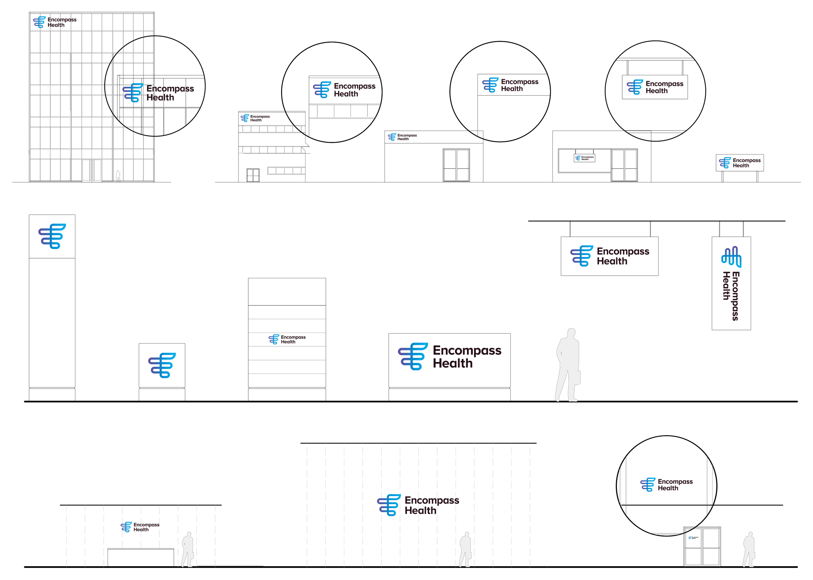
The signage family — building-mounted, monument, and wayfinding, drawn to standard.
The signage family — building-mounted, monument, and wayfinding, drawn to standard.
The signage family — building-mounted, monument, and wayfinding, drawn to standard.
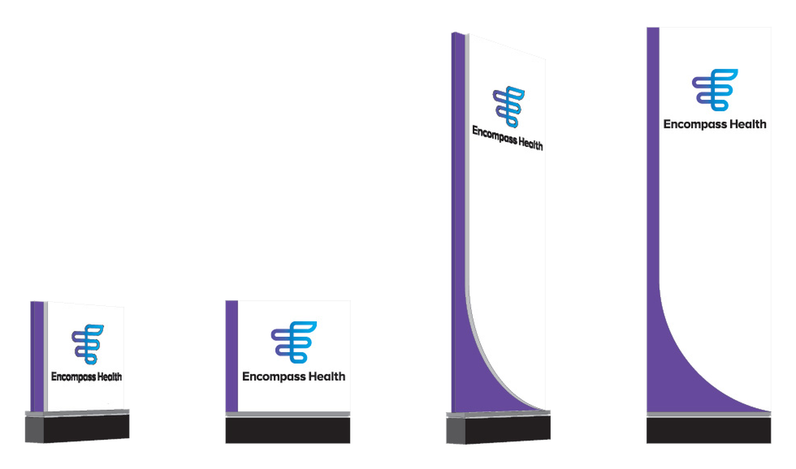
Pylon studies — proportions tested against the mark.
Pylon studies — proportions tested against the mark.
Pylon studies — proportions tested against the mark.
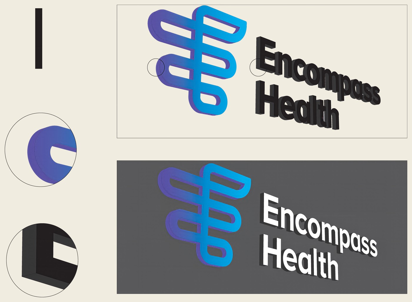
I introduced a curvilinear reveal of the illuminated panel behind the white metal signage element. This decision was Encompass leadership's favorite, and would carry into production. The justification for the diameter of the circular mask was a contested issue; I prefer using a radius based on the sign width. Proportion matters.
I introduced a curvilinear reveal of the illuminated panel behind the white metal signage element. This decision was Encompass leadership's favorite, and would carry into production. The justification for the diameter of the circular mask was a contested issue; I prefer using a radius based on the sign width. Proportion matters.
I introduced a curvilinear reveal of the illuminated panel behind the white metal signage element. This decision was Encompass leadership's favorite, and would carry into production. The justification for the diameter of the circular mask was a contested issue; I prefer using a radius based on the sign width. Proportion matters.
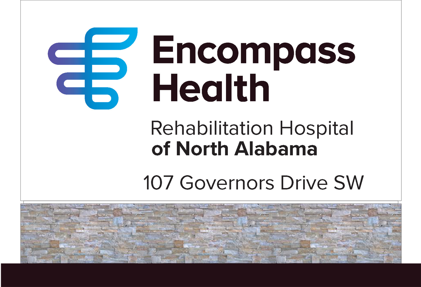
Freestanding flagstone plinth application.
Freestanding flagstone plinth application.
Freestanding flagstone plinth application.
Somebody is finding it at two in the morning, from a car, on the worst day of their year. That is when the facade sign does its actual work.
Somebody is finding it at two in the morning, from a car, on the worst day of their year. That is when the facade sign does its actual work.
Somebody is finding it at two in the morning, from a car, on the worst day of their year. That is when the facade sign does its actual work.
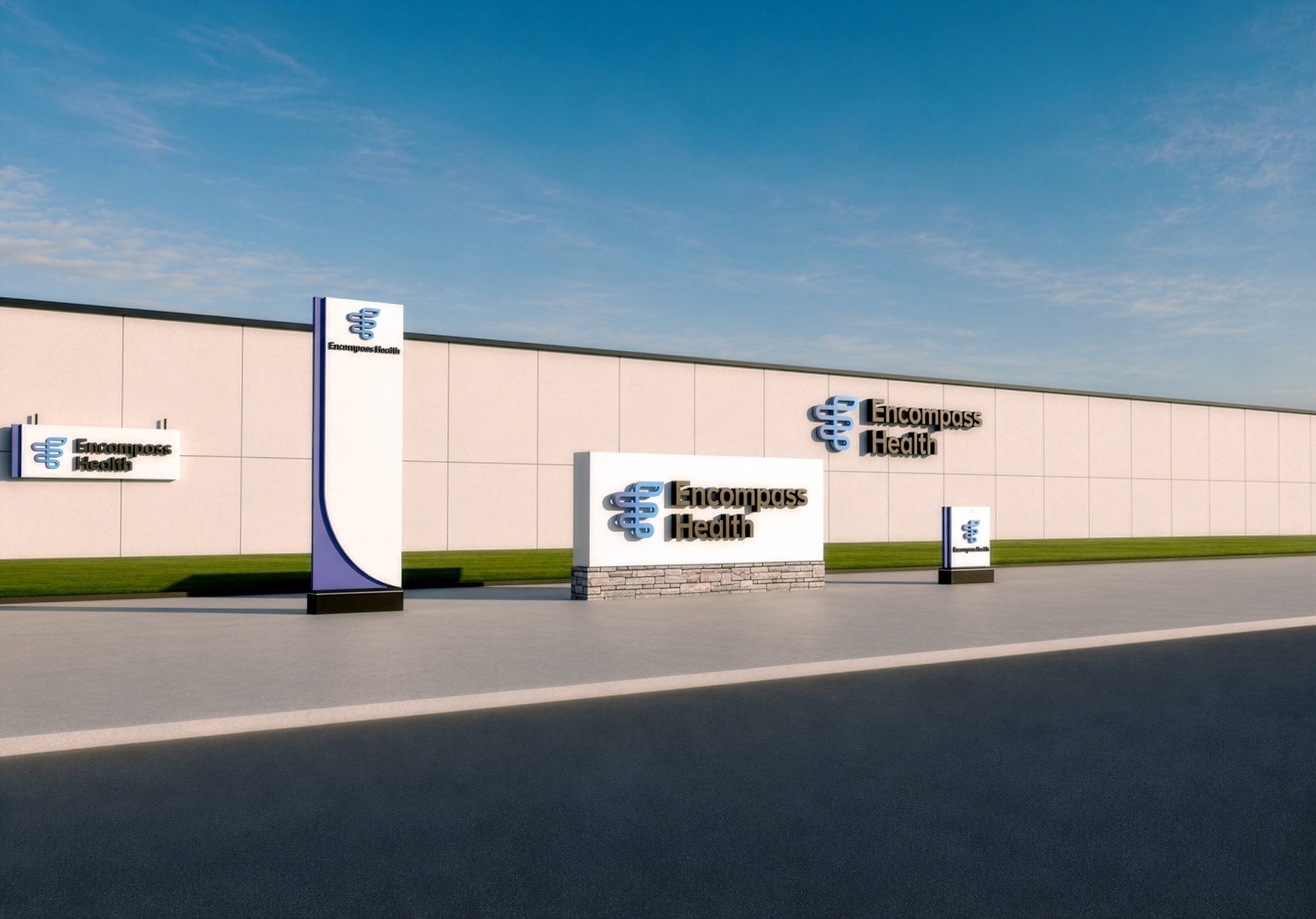
Render study — the curvilinear reveal won.
Render study — the curvilinear reveal won.
Render study — the curvilinear reveal won.
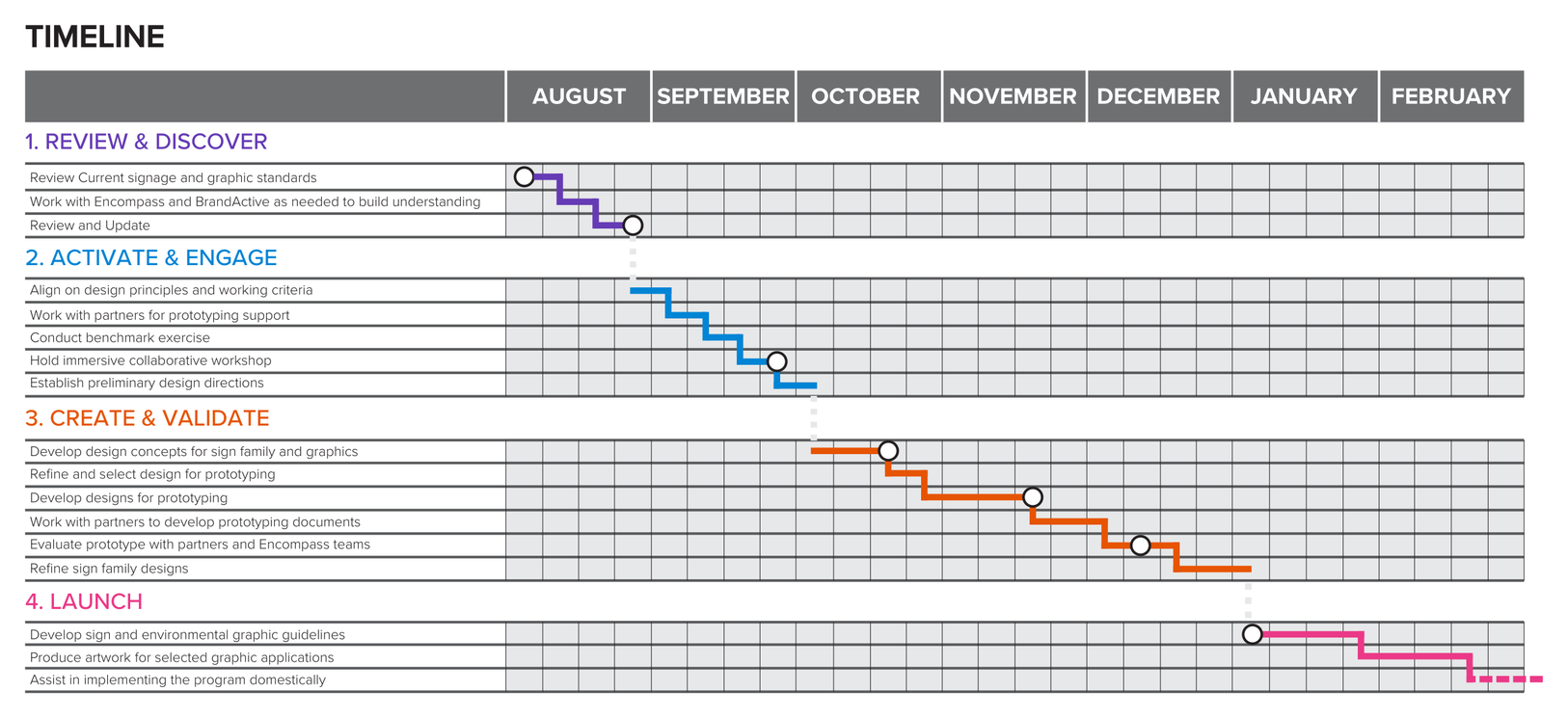
Encompass Health and Prophet project timeline.
Encompass Health and Prophet project timeline.
Encompass Health and Prophet project timeline.
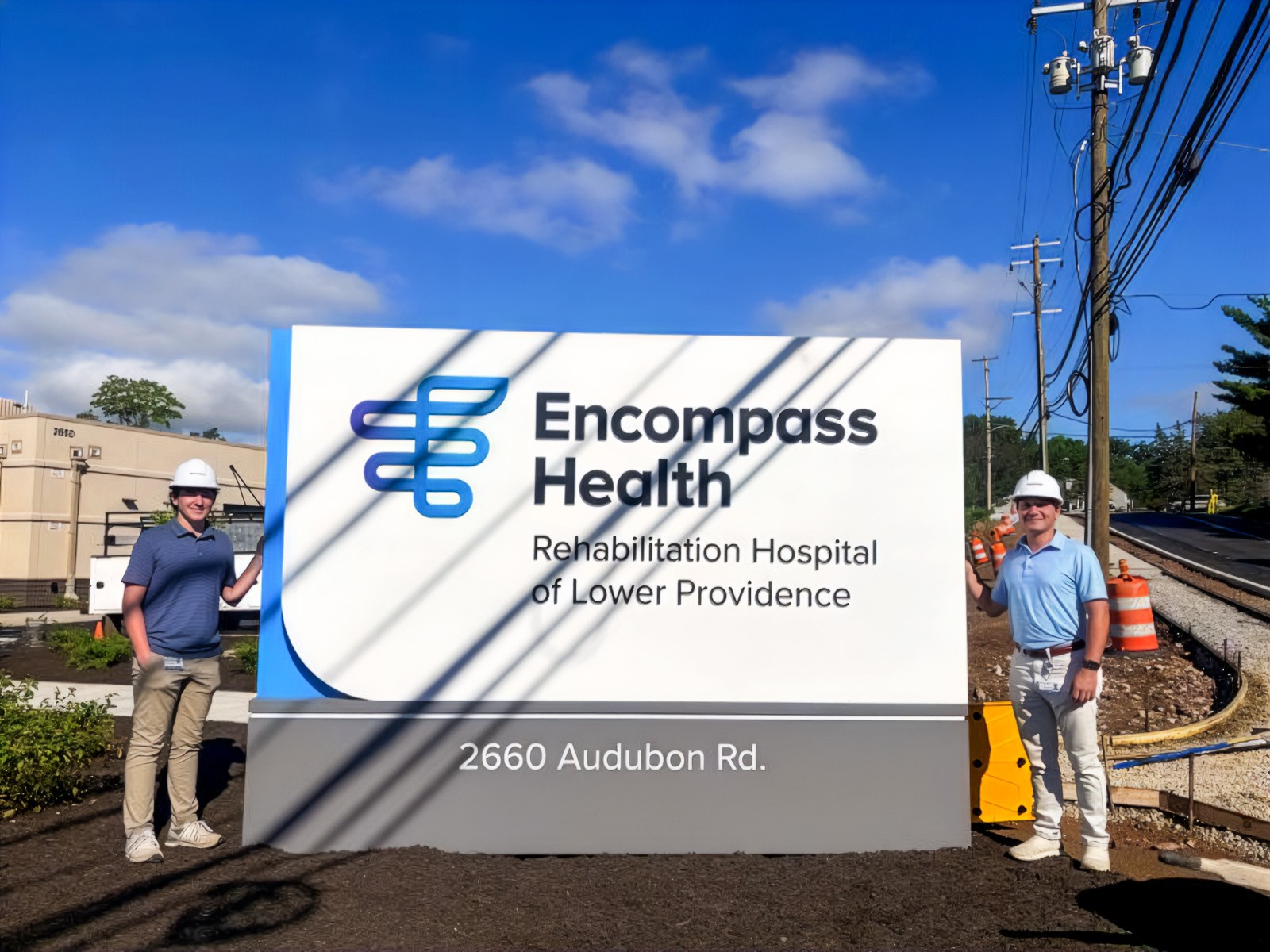
Wide pylon sign, illuminated — Lower Providence, PA.
Wide pylon sign, illuminated — Lower Providence, PA.
Wide pylon sign, illuminated — Lower Providence, PA.

Monument sign, stone plinth — Cypress, TX.
Monument sign, stone plinth — Cypress, TX.
Monument sign, stone plinth — Cypress, TX.